
Accessibility
Georgia Tech is committed to making sure that all of our websites meet or exceed the Web Content Accessibility Guidelines (WCAG). It is highly recommended that every communicator read through the guidelines entirely; you can access the W3 website from the button below.
The section on this page will go over some of the components of accessibility we have included in our modules, with further references at the end.
Guidance and Resources

Contrast
Achieving the correct level of color contrast is one of the primary ways to make sure your website meets accessibility standards. Text in particular must meet certain contrast ratios. These are outlined below, as pulled directly from the WCAG:
The visual presentation of text and images of text has a contrast ratio of at least 4.5:1, except for the following:
Large Text: Large-scale text and images of large-scale text have a contrast ratio of at least 3:1;
Incidental: Text or images of text that are part of an inactive user interface component, that are pure decoration, that are not visible to anyone, or that are part of a picture that contains significant other visual content, have no contrast requirement.
Logotypes: Text that is part of a logo or brand name has no contrast requirement.
The bulk of our modules have text settings that automatically change color when a certain background is chosen, to ensure these contrast ratios are met without the content creator having to do a thorough check. However, in some cases it may be necessary to change the color of the default text. If this happens, it is required that you check to make sure the size of the text and its color in combination with the background are contrasting at an acceptable level.
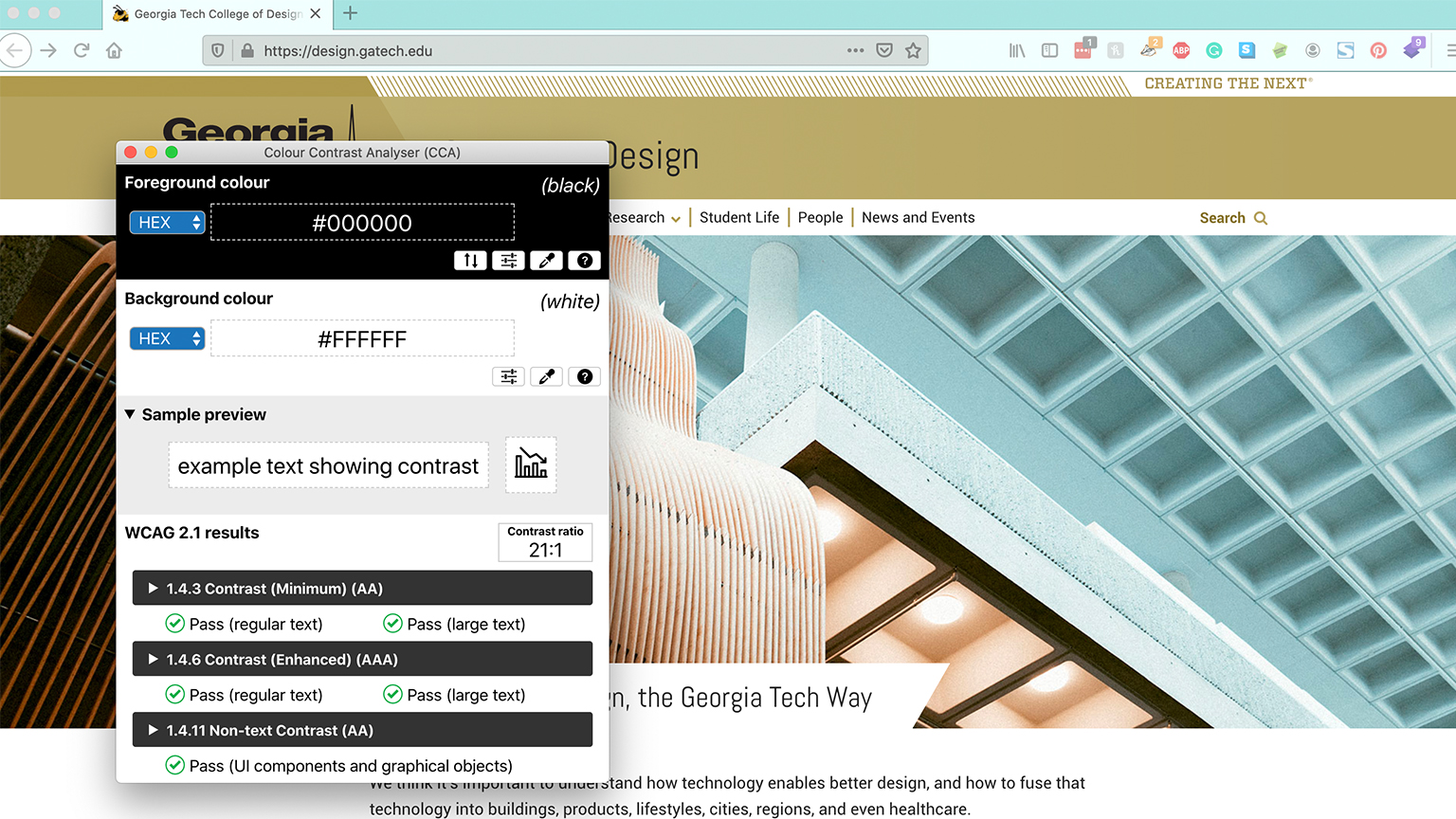
There are many tools available to help ensure you can easily check contrast ratios. We recommend the Colour Contrast Analyzer, which allows you to select a foreground and background color from anywhere on your screen to check for contrast ratios.
Images

Images are one of the most important features on our websites. Making sure every image is accessible to everyone is a key part of building out a page, and there are multiple steps to doing so. The information below is pulled directly from W3C website, and can be read in its original source at this link. The types of images themselves link to an example of each on the WC3 site.
"Images must have text alternatives (alt tag) that describe the information or function represented by them. This ensures that images can be used by people with various disabilities. This tutorial demonstrates how to provide appropriate text alternatives based on the purpose of the image:
Informative images: Images that graphically represent concepts and information, typically pictures, photos, and illustrations. The text alternative should be at least a short description conveying the essential information presented by the image.
Decorative images: Provide a null text alternative (alt="") when the only purpose of an image is to add visual decoration to the page, rather than to convey information that is important to understanding the page.
Functional images: The text alternative of an image used as a link or as a button should describe the functionality of the link or button rather than the visual image. Examples of such images are a printer icon to represent the print function or a button to submit a form.
Images of text: Readable text is sometimes presented within an image. If the image is not a logo, avoid text in images. However, if images of text are used, the text alternative should contain the same words as in the image.
Complex images such as graphs and diagrams: To convey data or detailed information, provide a full-text equivalent of the data or information provided in the image as the text alternative.
Groups of images: If multiple images convey a single piece of information, the text alternative for one image should convey the information for the entire group.
Image maps: The text alternative for an image that contains multiple clickable areas should provide an overall context for the set of links. Also, each individually clickable area should have alternative text that describes the purpose or destination of the link.
For a quick overview on deciding which category a particular image fits into, see the alt Decision Tree. The text alternative needs to be determined by the author, depending on the usage, context, and content of an image. For example, the exact type and look of a bird in an image might be less relevant and described only briefly on a website about parks, but may be appropriate on a website specifically about birds."
It's important to note that while building a page with our modules, you cannot save or publish the page if you have included an image that doesn't have an alt tag.
Accessibility Resources
