Website Components
Website Components
Modules are not the only elements of websites in the College of Design CMS. There are six different components that span all modules within the system:
- Website Menu
- Headings and Subheadings
- Body Text
- Pull Quotes
- Links
- Website Footer
The following sections will explain the design and reasoning behind each component and how the components can be used within the context of a module.
Select a Component to Jump To
Website Menu
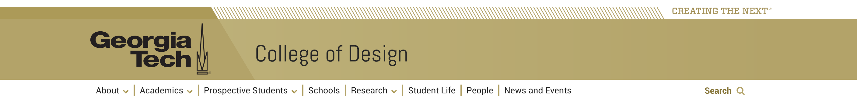
The Institute designed the header for each page. It features the Tech Gold / white color combination and the sledge shape. This will look the same on every website and cannot be changed.
The mobile site menu collapses into three bars. This is common practice across mobile sites, and you may have heard it referred to as “the hamburger”. The mobile menu is positioned the same as the expanded menu - on the home page image, and above the internal page images.
The menu itself is customizable, however, the structure and number of top level pages should always be discussed with the Director of Communications. Too many top level pages stretches the menu to an illegible degree, and obscure or altered titling of pages can be confusing to the user. When in doubt, look to other websites similar to you own and follow established website convention.
Headings and Subheadings
Headings announce a new modular section of the page. Every new section has a heading. This is consistent across the site, for both accessibility reasons and ease of use for anyone scanning the page for the information they are seeking. Headings are never ALL CAPS, in accordance with the highest website accessibility standards. The majority of headings are centered, which is common in mobile-first designs.
For Page Topper Modules and Image Feature Modules, the white-background module headings are placed on a white wedge that overlays the image. This is built into the module. In all other modules, the headings are situated in the body of the background color.
There are 6 levels of H tags built into the HTML editor for the modules. Subheadings drop in size proportionally between the heading and body text. Bold headings are intentionally avoided for accessibility reasons - instead, size is the indicator of a new section or subheading. This helps avoid the clunky feel that bold text brings to a page that otherwise feels light and bright. Subheadings are never ALL CAPS. The majority of subheadings are centered, which is common in mobile-first designs. To learn more about the use for each specific heading level, please refer to the Accessibility section of the Digital Styleguide.
Heading text color can be changed by selecting the "styles" dropdown menu in the HTML editor within a module. You must check accessibility contrast requirements before changing a heading color. Whether or not your text is the correct size and color to contrast its background is an incredibly important part of making sure your website is able to be experienced properly by every visitor. To learn more about the use for each specific heading level, please refer to the Accessibility section of the Digital Styleguide.
This is an example of the default H1 size, font, and color.
This is an example of the default H2 size, font, and color.
This is an example of the default H3 size, font, and color.
This is an example of the default H4 size, font, and color.
This is an example of the default H5 size, font, and color.
This is an example of the default H6 size, font, and color.
Body Text
The College uses left- aligned body text for accessibility reasons. The font is Roboto. Line spacing remains 10pts greater than the text size. On white backgrounds, the font is dark grey. On varying color backgrounds and photos with overlays, the text is either dark grey or white – the color is chosen for maximum contrast.
The body text will always have padding on the left and right, so that as screen size changes the text never reaches the edge. No text on the page will ever be smaller than the body text (with the exception of image credit text, and superscripts & subscripts which should both be used incredibly sparingly and only when absolutely necessary) for ensured legibility.
All the text you see in this section is body text. Below are the <span> types that can be automatically selected to adjust the way the body text looks.
This is an example of bold body text.
This is an example of italic body text.
This is an example of strikeout body text.
This is an example of superscript body text.
This is an example of subscript body text.
Links
Links should always be obvious, whether in a body of text, in a card module, or standing alone. The College has chosen to use either Tech Gold or Buzz Yellow as our clickable alert color for everything except in-line text, which is Georgia Tech Link Blue. This decision was made to help users easily identify links no matter what site or page they are on, as well as to adhere to Institute standards for linking.
There are multiple types of links that are used throughout the CMS, each of which are outlined and shown below.
Action Links
The action link is used at the end of a body of text. Its text describes the experience the user can expect once they click on the link. The text is the same size as the body text. If there are two necessary links for the same body of text, Action Link 2 is added.
Card Links
There are two types of links that automatically format within a card in a Card Module: the chevron link and the off page link. An important thing to note is that the entire card is a clickable element for accessibility purposes.
The chevron link is a visual representation of the Institute's focus on forward movement, without the heaviness of the Action Link block. This signifies to the user that they are about to click through to a different page on the same website.
The off page link makes use of a universally recognizable icon that signifies to the user that they are about to click through to a page on a different website entirely.
Inline Links
Inline links are clickable pieces of text within a larger text area. These text are underlined on hover and appear in most cases in Georgia Tech Link blue. These links can change color, but do so automatically based on the color that is chosen for the background of the module the link appears in. Do not change the link color in the HTML editor as this may cause the link to fail a contrast check.
This is an inline link in a longer sentence.
Pull Quotes
* Pull Quote styling is being developed. *
Please check back soon for updated information.
Website Footer
The footer is consistent across Georgia Tech websites, and is required and designed by the Institute. It makes simple use of the Georgia Tech brand colors, allowing for individual units to customize the list of links that are displayed at the bottom. This will appear at the bottom of every page on every site automatically.