A computer open to the School of Industrial Deisgn website.

Best Practices: Design

Best Practices: Design

Each of the modules we have developed work together to form the pages of our websites. However, in order to function properly and visually engage our audience, the collection of modules should create a pleasant rhythm.

The Light / Dark Method

This is where the art of writing and the sophistication of graphic design must work hand-in-hand. We know that’s difficult. So we designed an easy method for developers and communications staff to determine the correct color and order of modules on any given page - light / dark. Each module of any given page should alternate between a white background and a non-white one.

There are exceptions to this rule, of course, with the potential for grouped modules all having the same color background, or a whole page existing on a white background if the headlines and images are enough of a visual barrier between the sections. However, we highly recommend sticking with this concept as you build your pages in order to maintain design consistency and viewer understanding. 

If you are having doubts about the light / dark system, or think your page might benefit from a different design philosophy, check with the Director of Communications and/or Graphic Designer for the College.

Guidance and Resources

Colors

Images

Design Process

Resources

Colors

The College of Design has chosen a general usage for a few of the Institute's colors, which can enhance the immediate recognition of webpages and content made specifically for a certain audience. This, and other guidance on color choice, is explained below the cards containing our most used colors (not including white).

A swatch of tech gold.

Tech Gold

A swatch of metallic tech gold.

Tech Gold (Metallic)

A swatch of Buzz Yellow.

Buzz Yellow

A swatch of Blue.

Blue

The College uses two colors to signify a piece of content or a webpage's relationship to a specific audience:

Tech Gold: Graduate

Buzz Yellow: Undergraduate

Accenting and highlighting information on a page using these colors, when the page's content is related to one of these two audiences, is a good way to start building visual consistency across your site. We encourage the continuation of the light / dark system when selecting a module background color, regardless of what it is.

General Color Guidance

Each module that has a background enabled allows for a choice between the following colors:

Light Grey
Dark Grey
White
Tech Gold
Light Tech Gold
Light Buzz Yellow
Black

Having more choices for module background color can be a little daunting. We recommend selecting a go-to color for the majority of your "dark" modules, and sticking with it throughout your site. Generally speaking, this would default to light grey. You can highlight important information with a second background color, which helps the viewer notice which information is most important on the page.

Important notes: Only use black backgrounds for in memoriam modules. Black is a dark, overwhelming color, and if used more often it will completely take over the page. Additionally, the full Tech Gold should be used sparingly as well as it, too, is quite saturated and can cause the page to feel disjointed when used too often.

Text, like the background, can be selected and spans can be added to change the color. Do not change the color of your default text unless absolutely necessary. These are programmed into the modules for contrast reasons, and changing the color in HTML can cause your page to fail to meet accessibility standards.

Images

The Atlanta skyline as seen from a bridge over the I-75/85 access road in Midtown.

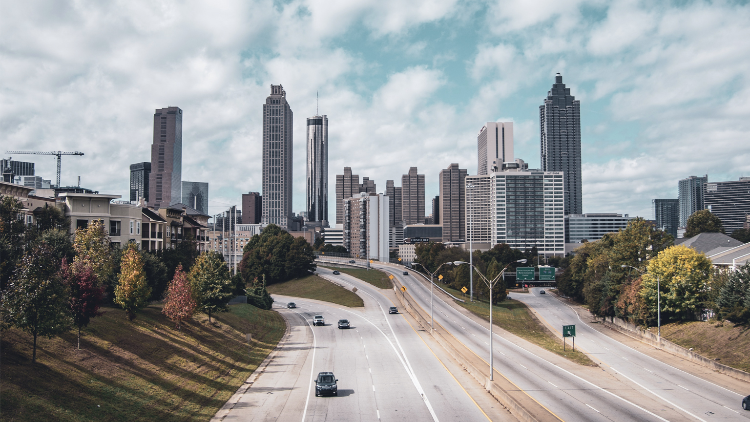
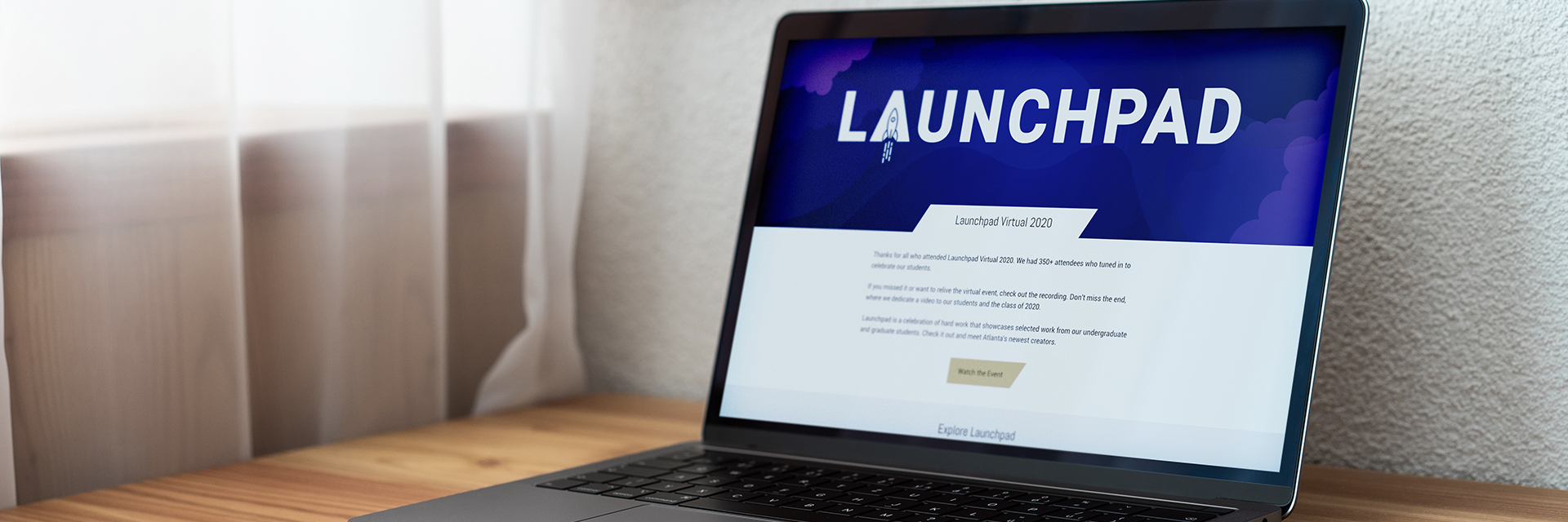
Image selection is an incredibly important part of building out and maintaining a functional and enjoyable website. Because most of the modules have a specific image size that is associated with them, it's important to understand what types of images to select and how to ensure your audience is getting the best experience and information when they visit your site.

The two most important things to remember when selecting images are resolution and responsiveness.

The Atlanta skyline shown in full resolution and pixelated, with an X and a check mark over the two images.

Resolution

If your image is not at least the size that the module requires, do not use it. Strange visual things can happen when smaller images are stretched to fit a certain area, and there is nothing that makes a website look less professional.

Additionally, make sure your image are proportionally the same as the required image size. The modular system will automatically scale them down if necessary, but using a different aspect ratio can, in some cases, distort the view of the image or create gaps in the module.

Last but not least, preview your images on the web page. If you see pixelation, or space in the module where there should be none, edit your image accordingly, or pick one with a higher resolution.

An iPhone sitting on a desk with a notebook and a plant, seen from the top.

Responsiveness

The content of your images should always be visible, even if the image needs to shrink down on a smaller screen. Selecting appropriate images that will shrink and resize well is an important step in the design process.

The most important content in an image should be in the middle - this allows the user to easily focus on that when scrolling on a smaller screen. And, if the image is cropped or shifted at all as screen sizes change, the content that is most worth seeing remains visible.

Because most of the traffic to our sites is mobile, chose images that do not require the viewer to search through small parts of the photo for something relevant. No one wants to squint to see the point of an image. Crop your images accordingly to highlight the reason why this photo is paired with a certain piece of content. The less a viewer has to work, the more likely they are to stay on the page.

Design Process

Though there are plenty of different ways to design and build a page, here are five steps we recommend following as you build out content for your site to cut down on build time and ensure your pages are as efficient as possible:
 

  1. Content Creation (includes image selection)
  2. Wireframing (includes color selection)
  3. Page Building
  4. User Review
  5. Editing

Content Creation involves writing all of the text that will appear on the page, selecting images that relate to relevant text, and determining which additional pages will need to be linked to as you are building the page. Edit your text and ensure it meets content standards, review your images and crop them to size, write alt tags for all of your images and make sure your images are named appropriately and make a list of the links or other pages that need to be created in order to launch.

Wireframing involves either using a computer program or drawing out a basic structure for the page. This is when you can select the modules for your content that make the most sense, ensure your page flows in an appropriate manner and the correct content is highlighted, select colors for you module backgrounds, and ensure you have not created too little or too much content.

Page Building is translating your wireframe to actual Drupal 8 modules. At this stage, the page building itself should be straightforward and efficient, as you already have all of your content and have laid out the page in your wireframe. If you are scraping content from a word document or different online source, make sure you clear formatting before you paste.

User Review is key to making sure your page functions as you planned. Select a small group of coworkers, students, and faculty to give you their impressions of the page. What was their experience like as they clicked through? Did they quickly find the information you were hoping they would? How do they recommend improving the layout or content?

Editing takes the feedback you recieved during the User Review and applies it to the page. Make sure you are careful what changes you decide to implement - check with the College of Design marketing staff if you have doubts about what to update.

Resources

Below is a collection of off-page resources that provide insight, advice, and guidelines for creating beautiful websites that function efficiently.

HubSpot Education

Provides blog posts and articles about writing, web design, and marketing.

A List Apart

A collection of articles about web design and development, with a focus on best practices.

siteInspire

A showcase of excellent web and interactive design.

UX Movement

How to design intuitive user experiences through tips, techniques, and best practices.